Year
2018
Proposal: a simple but warm welcome experience
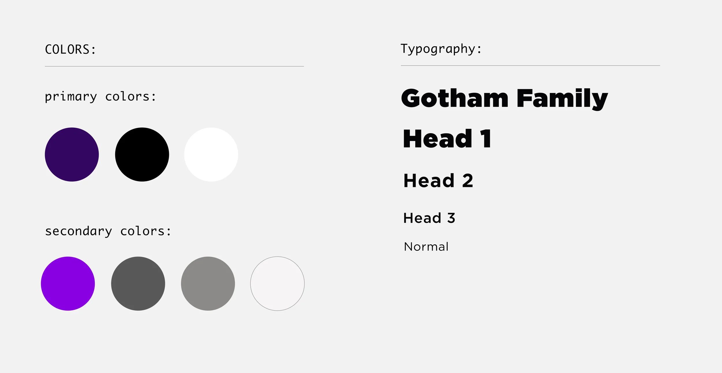
User Research, User Experience Design, Visual Design, Motion Design
TASK
Your school has built a new student center and is looking to you for some design expertise.
Design a welcome experience for visitors of the new center utilizing the large-format touch screen kiosk in the lobby, which displays upcoming events, news headlines, and next week’s weather forecast. Create three motion sequences that can loop in the lobby, transitioning between the different types of content.

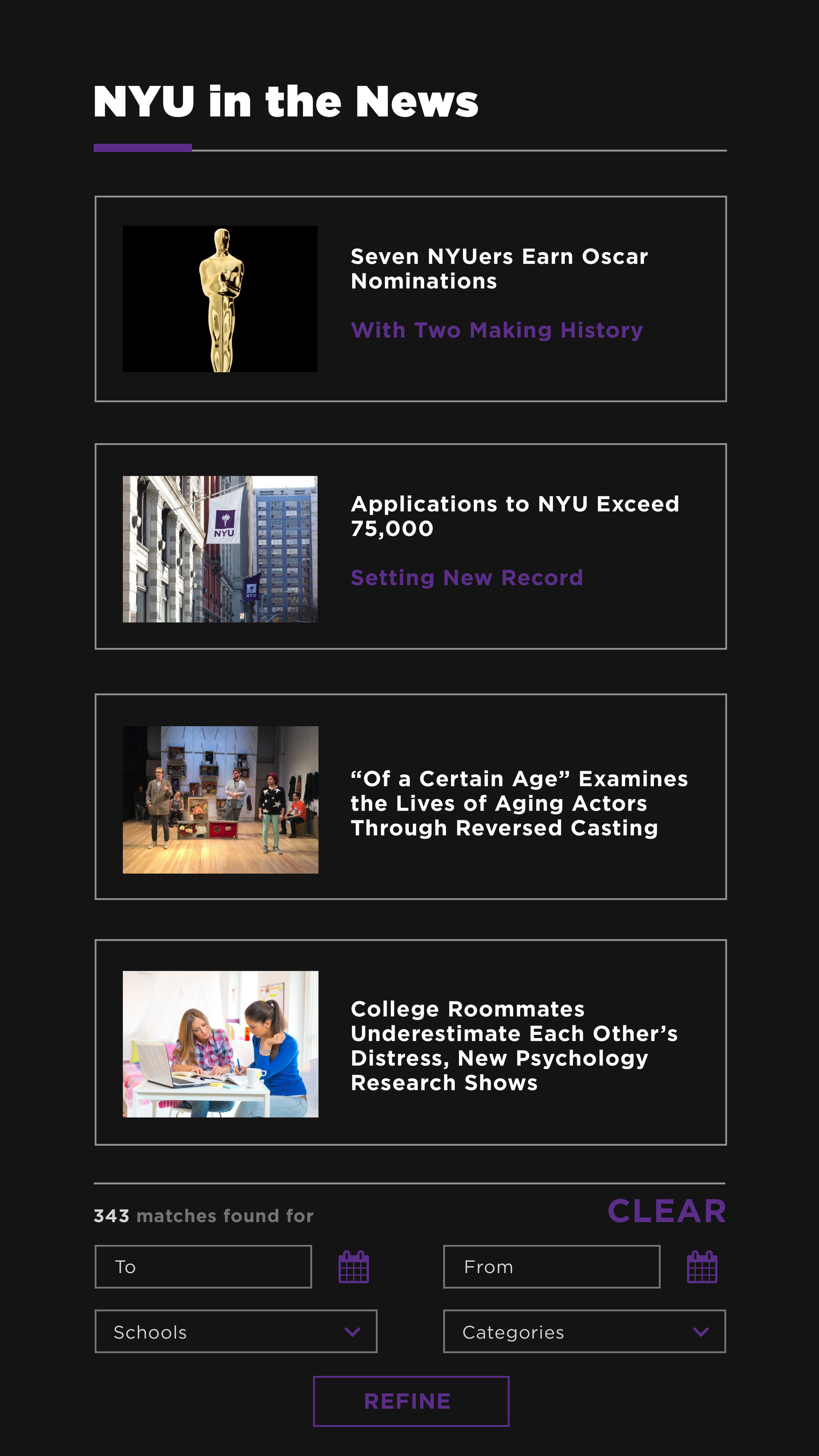
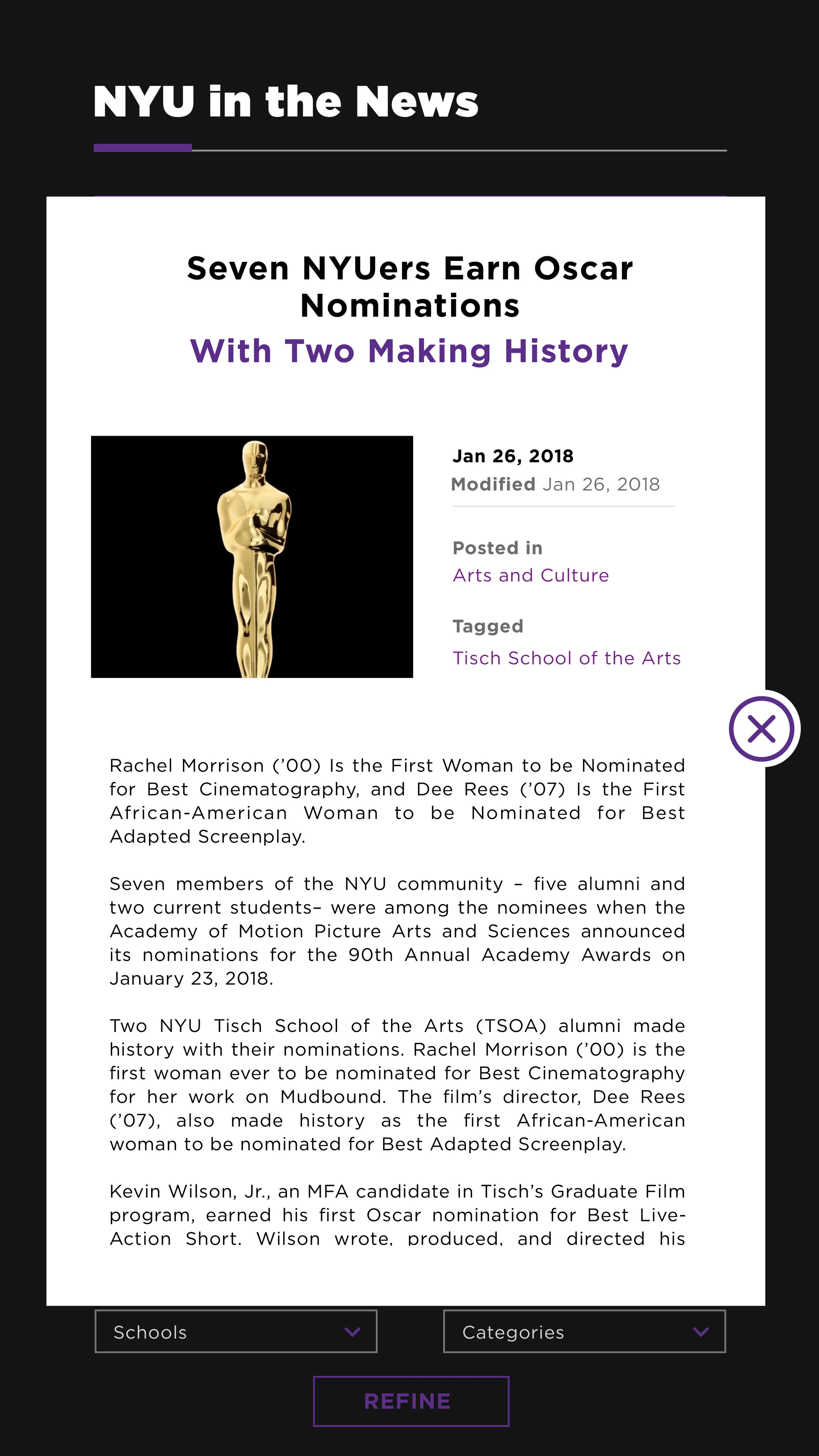
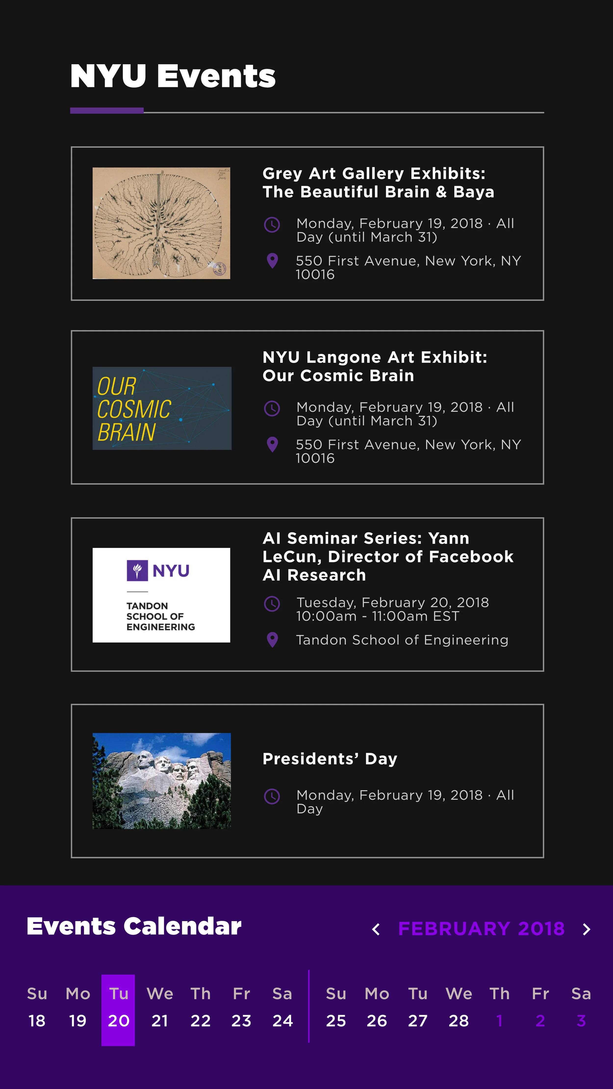
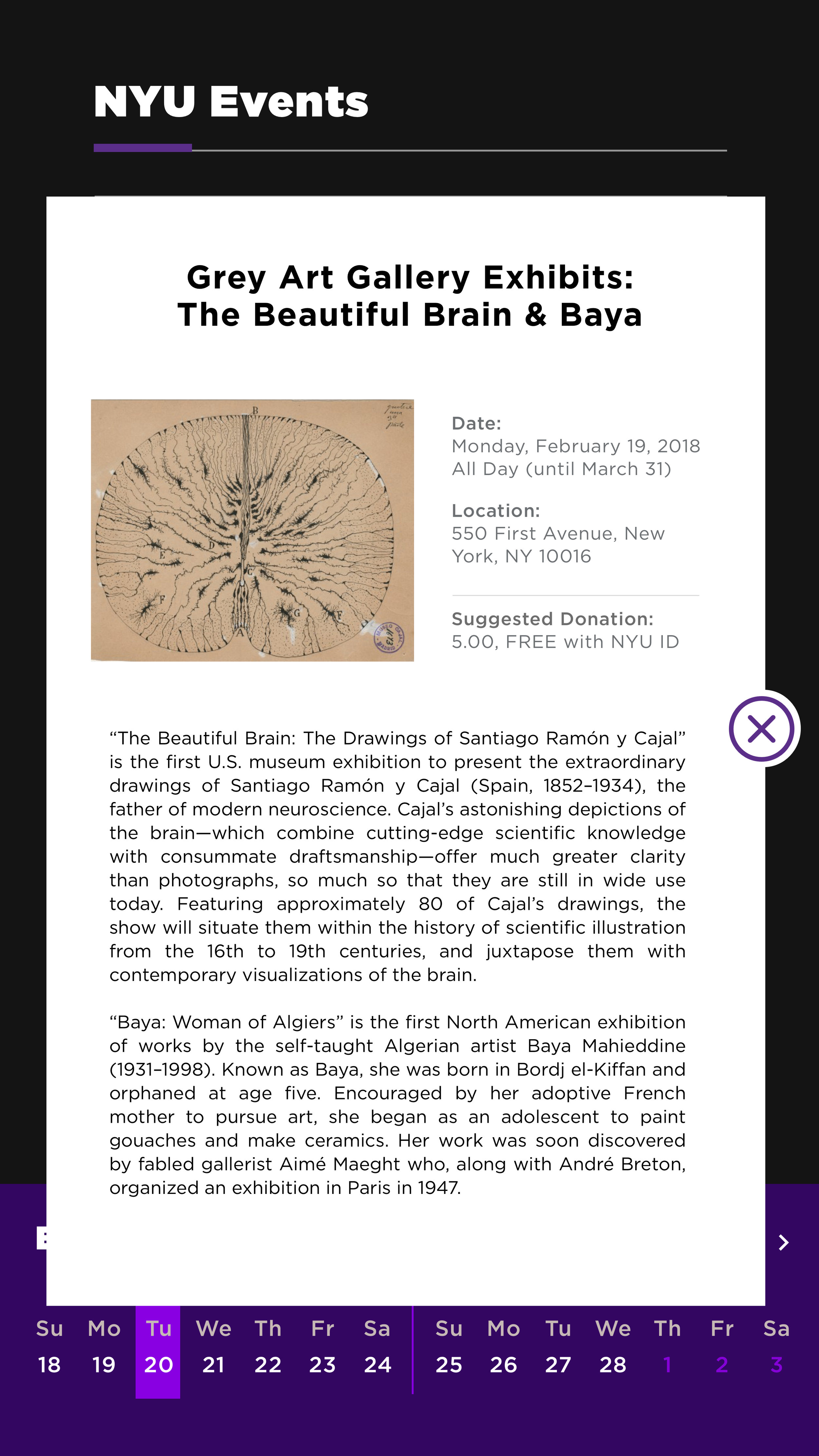
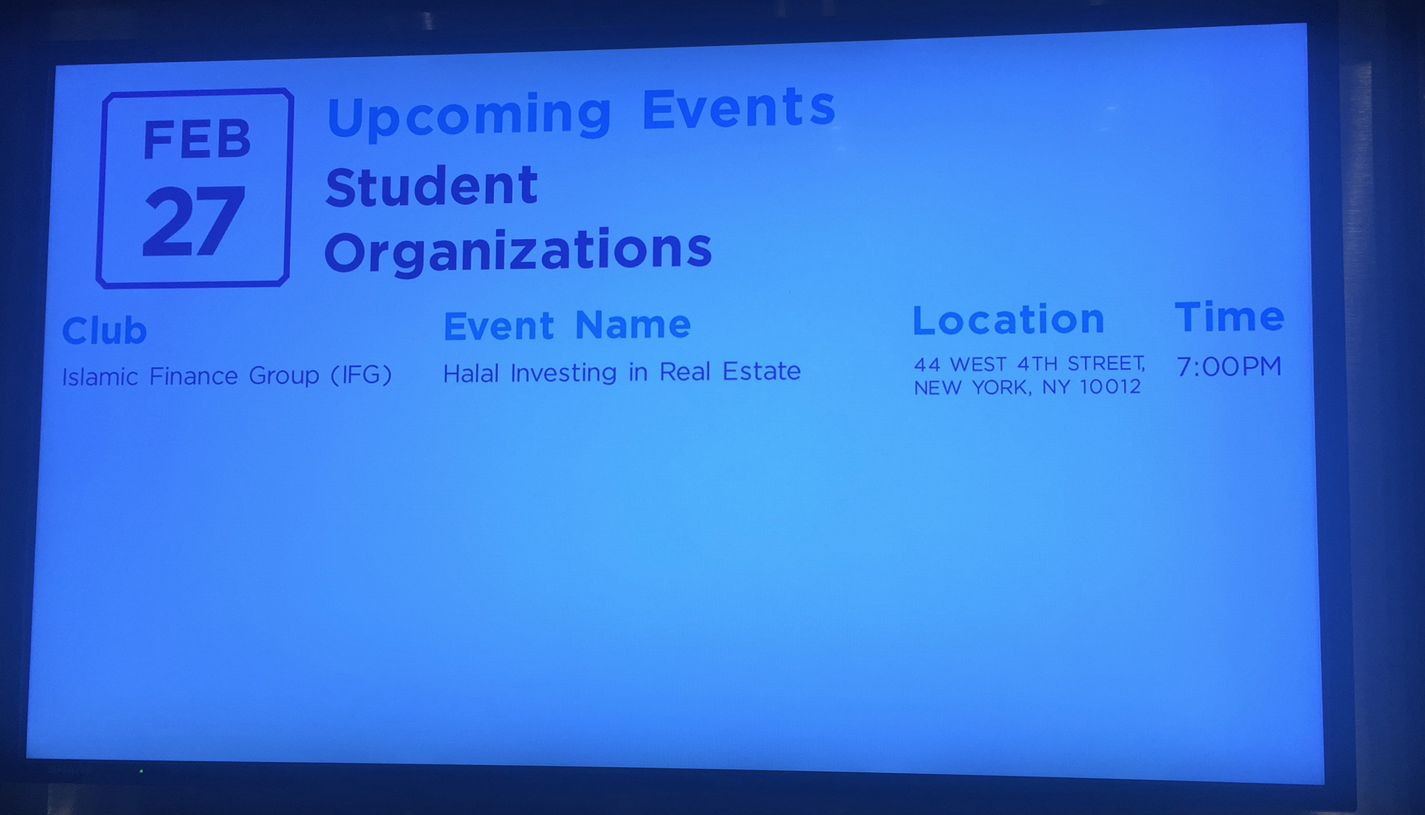
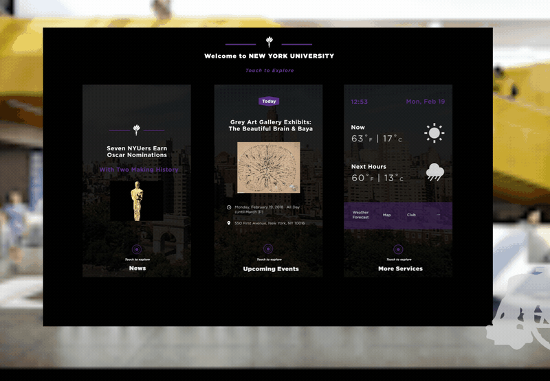
Welcome to NYU
Overall View of Design
Early Stage :
Task analysis
Break Down the Task
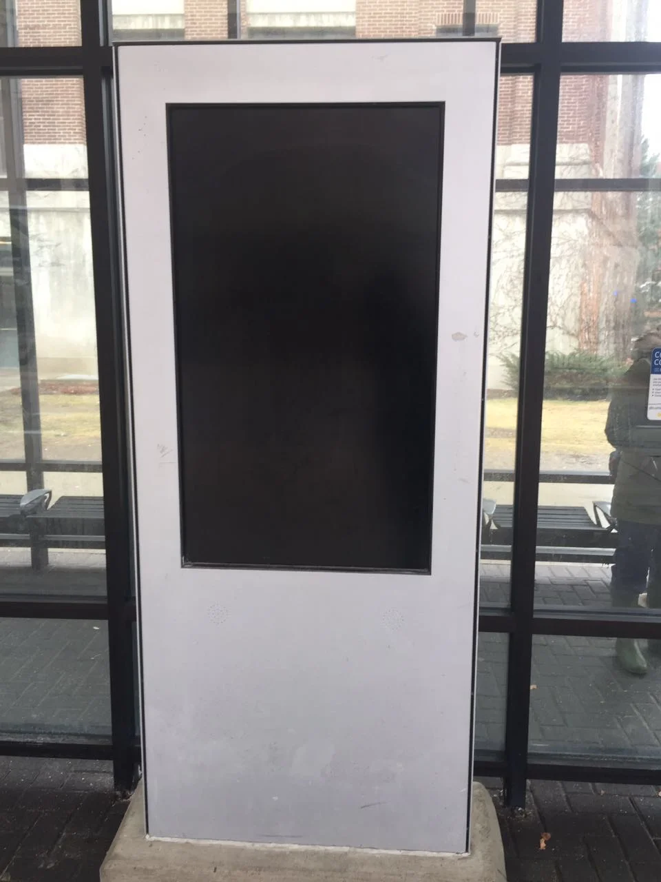
How: kiosk, large-format, touch screen
Content: Upcoming events, News headlines, next week's weather forecast and etc.
Who: visitors
Where: the lobby of the new student center
What: a welcome experience
Early Stage :
Task analysis
User Analysis
User Scenario
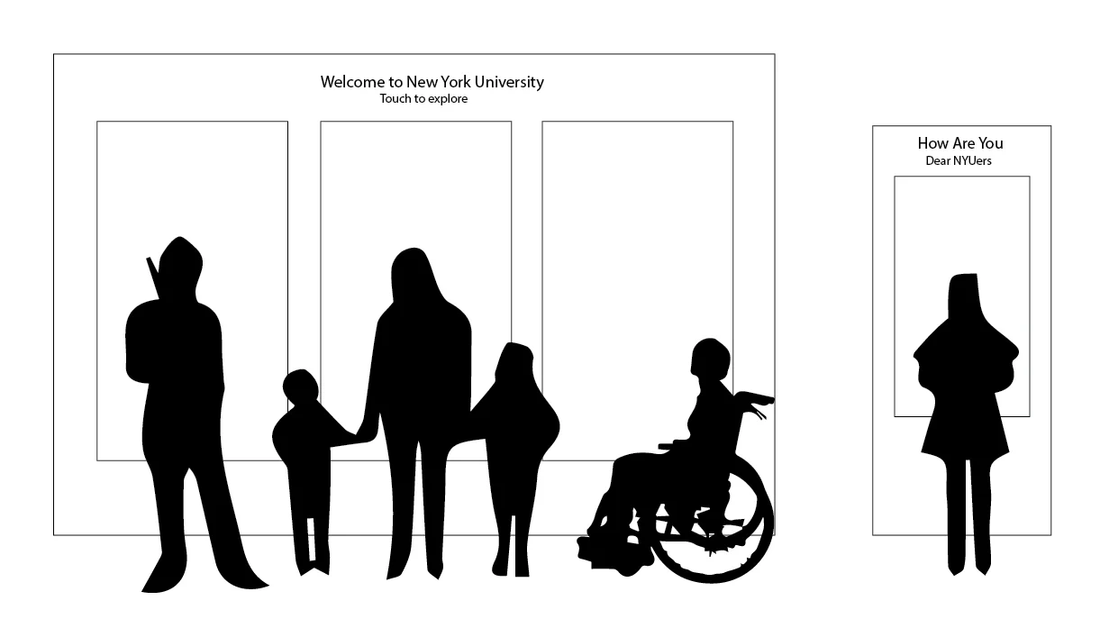
Who: Different Types of Visitors
Type 1
Freshman
Persona: Jenny is a freshman of NYU. Today is her first day of the school. She feels excited about upcoming school life but at the same time, she feels a little bit anxious about unexpected future. She wants to know more about her school, her school life and more importantly, gains confidence.
Type 3
Current students, teachers and staff
Persona: Barack is a senior year student of NYU. He has a very busy school day. Today he goes to the student center to meet his classmate as usual. He waits in the lobby of the student center and wants to get some quick information about school's events, especially events from his department, and his schedules this week.
Type 2
Parents, potential students, tourists, academic visitors
Persona: Claire is going to apply for graduate school. Today, she and her parents go to visit NYU. They first go to the student center to get some tour guide. They want to get a general impression on NYU and how to tour around it.
Early Stage :
Task analysis
User analysis
User Scenario
Contextual Inquiry
Observaton
Interview
Where: Lobby of the New Student Center
Before making design decisions, I firstly went to our school's different student centers to observe different kiosks & screens, and people’s behavior. Then by using think-aloud protocols, I interviewed users from a bigger perspective.
Some questions I asked them:
What do you usually do in student center?
Do you notice any screen or kiosk in student center? Do you notice any screen or kiosk in the school? What are they used for? Do you use them a lot?
Can you describe a welcome experience of your first day to school? How do you feel about it? Did you have any difficulty? Any impressive welcome experience did you have before?


At the same time, I asked my friends from different schools of USA, to collect pictures and video records of their schools' kiosks, especially kiosks in the student center for me.

Early Stage :
Task analysis
User analysis
User Scenario
Observation
Contextual Inquiry
Interview
Problem Identification
The Discovery
Schools rarely have touchable kiosks in the lobby
Most schools have different types of screens showing events and welcome videos. They are mostly placed on the wall of elevator and at the entrance of lobby, but they are not touchable. Touchable kiosk is only used for specific services, for example, searching book, navigating floor plan of the building and etc..
People rarely notice kiosk or watch screen video
When I interviewed different users or asked my friends if they remember any kiosk or screen in the school, I was surprised to find that most of them didn't remember any of them. The only kiosk they remembered were the kiosk in the library or the kiosk where they wait for bus. Then I listed some kiosks to them, and they said they didn't notice them before.
From my observation, I found that most kiosks are very small, so people have to come closer to interact with them. However, if the kiosk is not as useful as book searching machine, people seldom stop and approach to use it. Besides, most of the loop sequence of screens are too long, so if people walk by and don't find the information they want, they just walk away again.
Touchable experience is more memorable and warmer
I also found that touchable experience is much more memorable and gives people warmer experience than merely watching screen video. Some users told me they once tried to touch the screen in the lobby of their school, but found that they were not touchable. Then, they never watch or notice the screen again.
Lack quick information and feelings of belonging
Users told me it would be good if they can see some quick information, like events, news, weather report when they pass by. The information should be large and obvious enough, so that they don't have to walk closer to check. If they are interested, they can approach to explore more. Besides, some users said they sometimes feel that their schools lack group cohesion and feelings of belonging. School email subscriptions and websites are major channels they learn school news and events, but this experience is too personal and lack collaborative feeling.
Early Stage :
Task analysis
User analysis
User Scenario
Observation
Contextual inquiry
Interview
problem identification
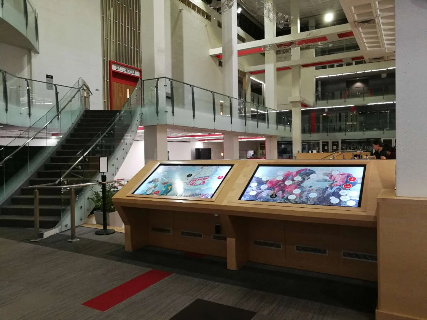
comparative products
Compare different types of kiosks
Pros:
Customizable, Personal Experience, Information Concentration. People can see the information when they walk by.
Cons:
Information is small and is hard to notice. People have to come closer to check the information. Only one people can use at a time.
Pros:
Customizable, Personal Experience, Information Concentration. Friendly to children and people with disability.
Cons:
Information is small and is hard to notice. People have to come closer to check the information. Only one people can use at a time. People can't see the information when walk by.
Pros:
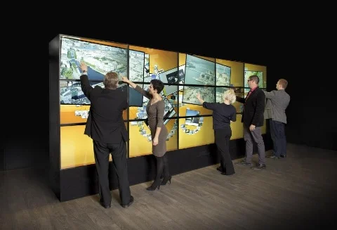
Large and noticeable information; collaborative; a lot of people can use at a time
Cons:
not customizable; lack personal experience; information is less concentrated; only show one type of information at a time
Early Stage :
Task analysis
User analysis
User Scenario
Observation
Contextual inquiry
Interview
problem identification
comparative products
IDEATION
My Choice of Kiosk

Collaborative and Personal
Large Parallel Information and Concentrated Content
Simple, Clear and Accessible
According to user research and analysis, I combined different kiosks' pros and came up with a solution.
I separate the welcome experience of kiosk into two parts.
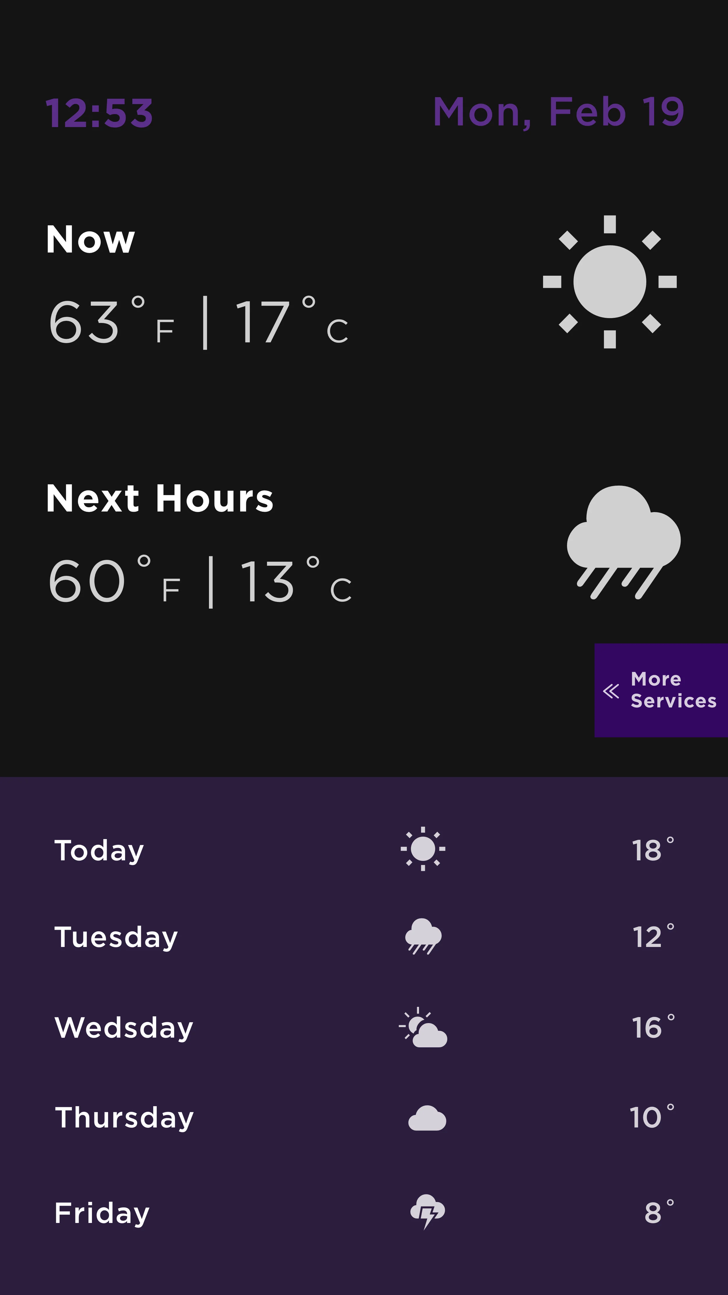
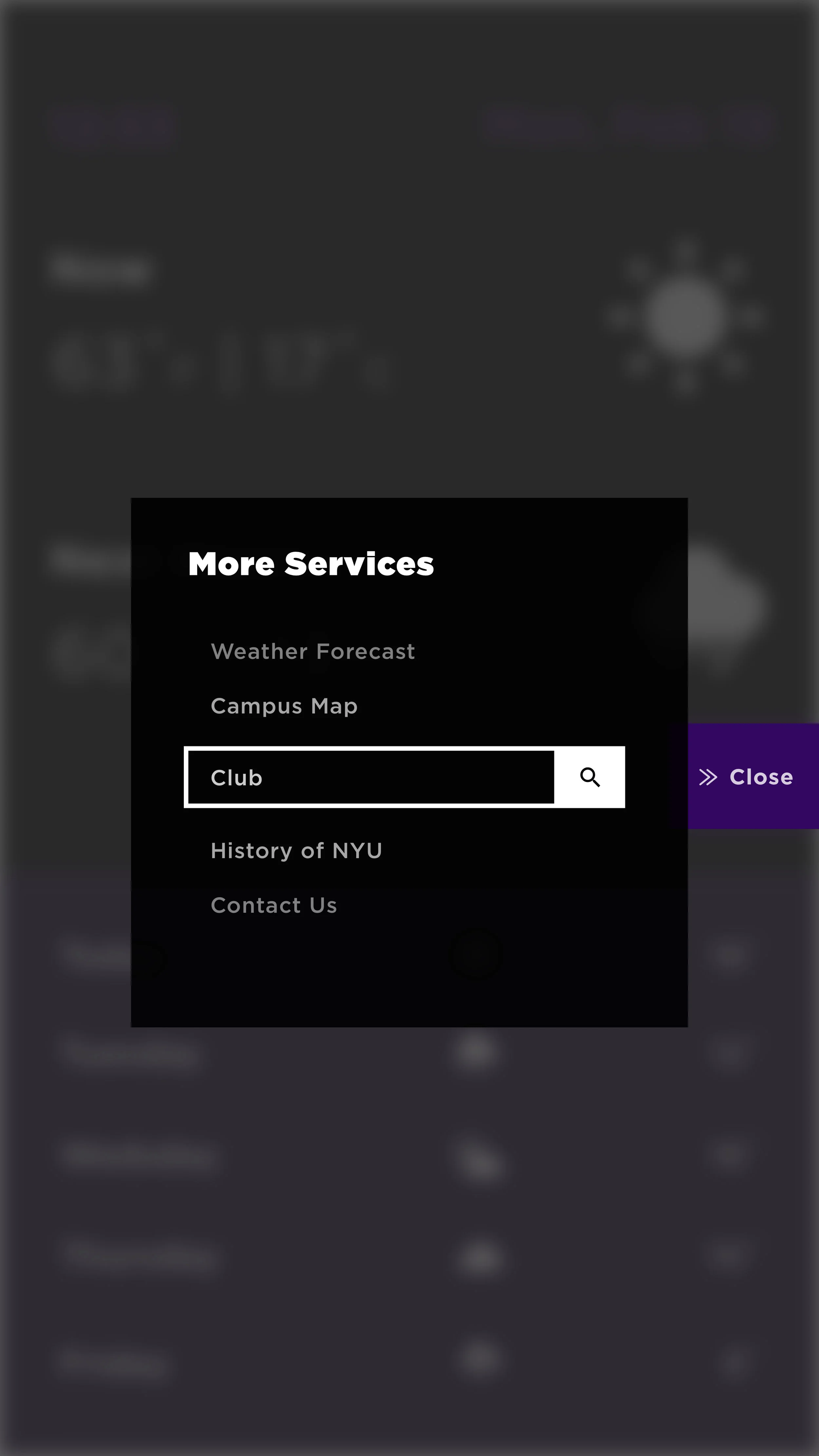
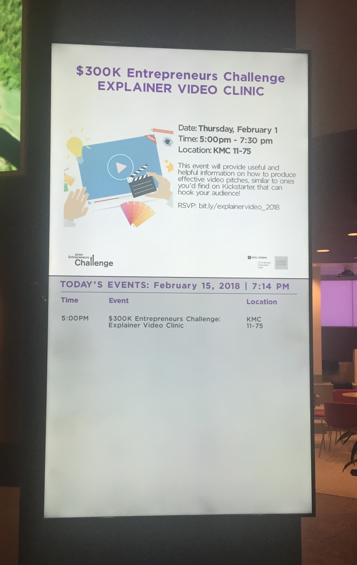
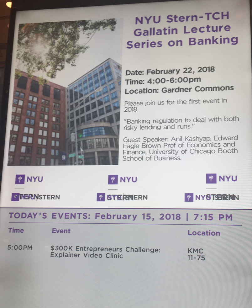
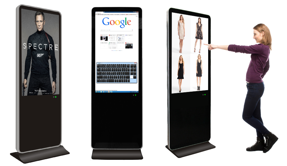
The left part is a large-format touchable screen, composed of three kiosks which are 16:9, designed for all types of users. The first kiosk from the left, only shows the information of news in the university. The middle kiosk shows events in the university. The last kiosk shows weather forecast and other services.
The right part is a small kiosk, designed only for current students, teachers and staffs of the school. Users can use their ID card or face recognition system (if doable) to log in, and then check their schedules in this week and events of their department.
Middle Stage:
Low-fidelity Prototype
Usability Testing
Iterative Design


Paper Prototype
Keep Consistency with other products of NYU
First Prototype
Problems:
too much information
no motion guide
some visual problems
Late Stage:
High-Fidelity Prototype
Usability Testing
Final Prototype
Motion sequences looping in the lobby
Sensors detect approaching visitors
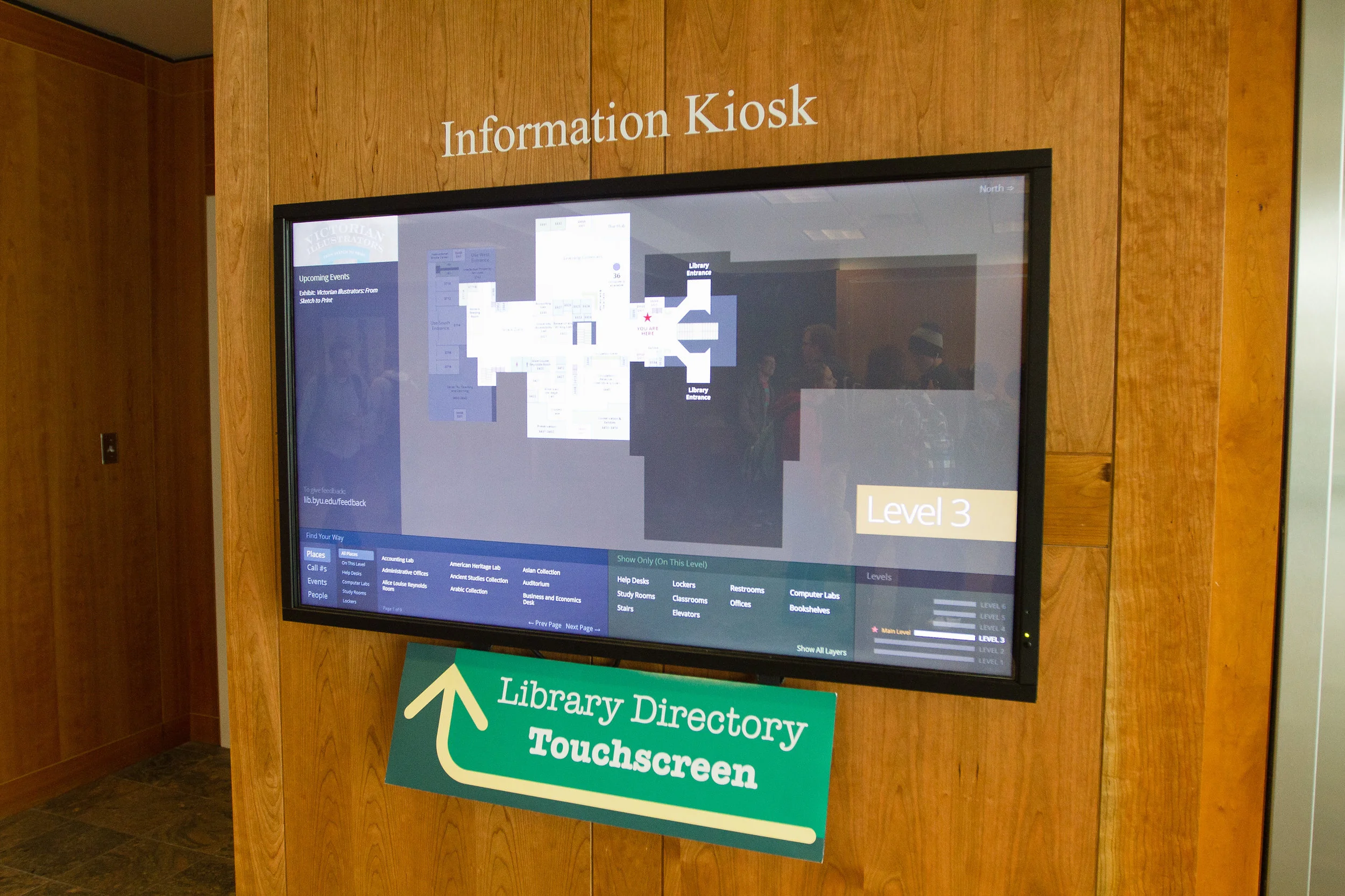
Touch Screen Example
Visual Design of Screen when users touch it